The financial markets of 2026 are influenced by algorithmic execution, high-frequency trading platforms, and relentless macroeconomic news cycles. For the retail or institutional participant attempting to navigate this complex market environment, relying solely on fundamental analysis or emotional intuition may present limitations. To participate effectively in the market, one must understand how to read the language of price itself.
Technical analysis is not a predictive science that guarantees future outcomes. It is a strict discipline of probability management. It provides a visual framework for understanding the collective psychology of market participants at any given moment.
By analyzing historical price movements, trading volume, and mathematically derived indicators, a disciplined observer can identify structural imbalances between supply and demand. These imbalances highlight the specific zones where potential trading opportunities may arise.
This comprehensive technical analysis guide serves as the ultimate foundational toolkit for technical analysis in the modern market. It synthesises the critical concepts explored in our core pillar articles, moving from the broad strokes of long-term trend identification down to the microscopic level of individual price bars.
We will explore the structural authority of moving averages, dissect the nuanced differences between primary momentum indicators, define the mechanical realities of support and resistance, and decode the raw psychological data embedded within candlestick patterns.
The objective is to equip the observer with a complete, integrated system for reading the chart, allowing them to formulate more structured trading decisions with reduced emotional influence
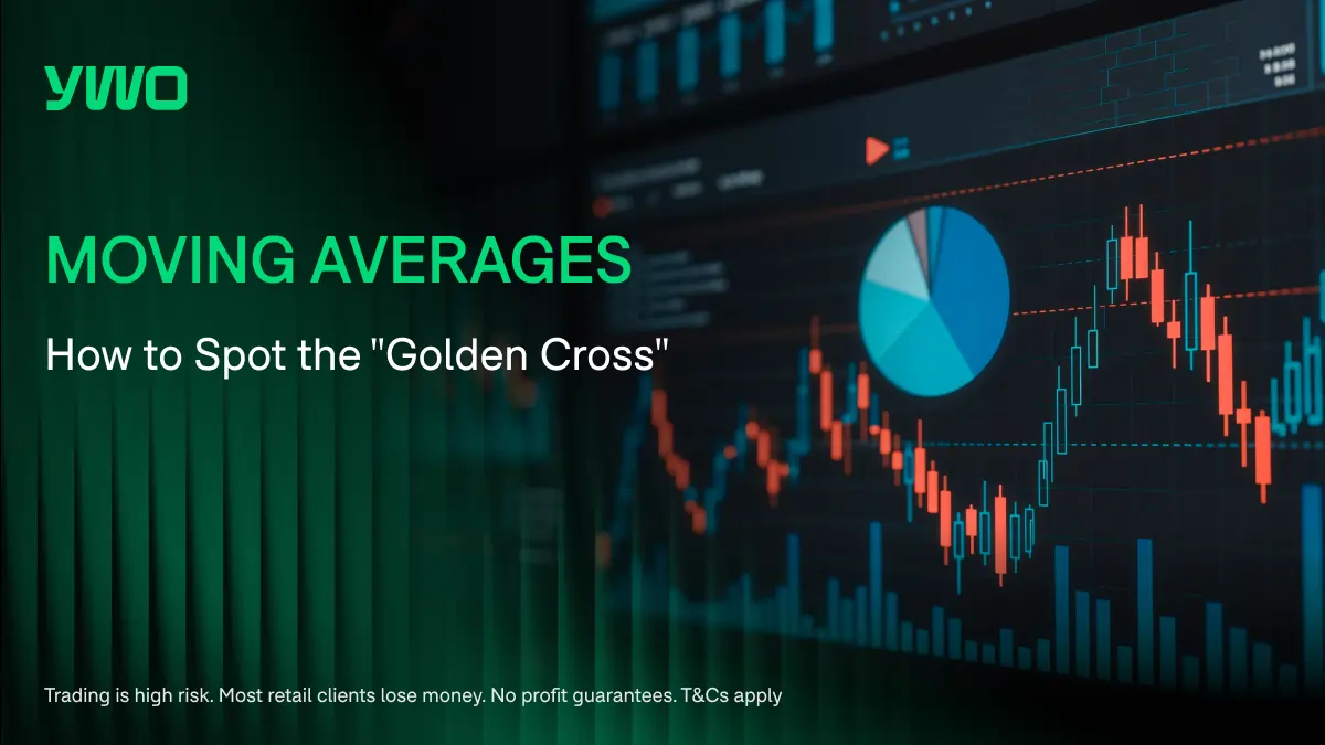
The Structural Authority of Moving Averages
A common starting point of technical approach begins with identifying the primary trend. Attempting to execute trades against the dominant directional momentum of an asset may increase the risk of losses. To filter out the daily noise of market volatility and help identify the underlying structural trend, participants utilize moving averages.
A moving average is a continuously calculated mathematical line that smooths out price data over a specified period. When the current price of an asset is trading comfortably above a rising moving average, the structural trend is definitely bullish. Buying pressure may be dominant.
Conversely, when the price is trapped below a declining moving average, the trend is bearish, and selling pressure may influence the market structure.
While individual moving averages provide valuable context, the true power of this tool becomes more apparent when multiple averages are combined to generate a crossover signal. The most heavily scrutinized and institutionally recognized crossover event in technical analysis is the Golden Cross.
Decoding the Golden Cross
A Golden Cross is a specific, long-term bullish signal that occurs when a relatively fast-moving average crosses aggressively above a slower, structurally significant moving average. This event indicates that short-term buying momentum has accelerated to the point where it is now overpowering the long term historical average of the asset. It is the potential confirmation that a new bull market has begun.
The classic, commonly used parameters for a Golden Cross involve the fifty-period moving average and the two-hundred-period moving average. The two-hundred-period line represents the ultimate structural baseline of the asset. It is a level often used to distinguish a long term bull market from a long term bear market. The fifty-period line represents the short term momentum of the current quarter.
When the fifty-period line crosses from below to above the two hundred-period line, it triggers the Golden Cross. This is not a signal for high-frequency day traders. It is a broader , structural shift that often precedes multi-month or even multi-year sustained uptrends.
However, trading the ‘Golden Cross’ phenomenon requires patience. Because it relies heavily on lagging indicators, the actual crossover often occurs after the initial price movement from lower price levels has already happened. The sophisticated participant does not buy the exact moment of the cross. They wait for the potential pullback that follows, using the newly crossed moving averages as a dynamic area of structural support to align with the broader trend based on their analysis..
Momentum Mechanics: RSI vs MACD
Once the primary trend is established using moving averages, the trader may assess the internal health of that trend. Is the momentum accelerating, or is the momentum weakening? To answer this question, participants deploy momentum oscillators. The two most prominent and frequently debated tools in this category are the Relative Strength Index and the Moving Average Convergence Divergence indicator.
While inexperienced observers often use these tools interchangeably, they measure entirely different mathematical concepts and excel in entirely different market environments.
The Relative Strength Index
The Relative Strength Index, or RSI, is a bounded oscillator that measures the speed and change of price movements. It operates on a strict mathematical scale from zero to one hundred. The primary function of the RSI is to identify extreme overbought or oversold conditions within a specific timeframe.
When the RSI reading surges above the seventy level, the asset may be considered overbought. This indicates that the buying pressure has been sustained over a period of time, and a temporary pullback or consolidation is likely to occur. Conversely, when the reading plunges below the thirty level, the asset is considered oversold, suggesting that the selling pressure has increased significantly and a relief rally follows.
The RSI is an exceptional tool for trading range-bound markets. When an asset is trapped in a sideways channel, the RSI can provide signals for fading the extremes, which may be used to identify potential entry and exit points within the range. However, during a massive, fundamentally driven breakout, the RSI will remain pegged in the overbought territory for weeks, generating signals that may not align with price direction and may lead to losses to those relies on them without additional analysis
The Moving Average Convergence Divergence
The MACD, in contrast, is an unbounded trend following momentum indicator. It is constructed by subtracting a longer-term exponential moving average from a shorter-term exponential moving average. The resulting line oscillates above and below a central zero line.
Unlike the RSI, the MACD does not measure overbought or oversold conditions. The absolute value of the MACD line is generally less emphasised. The key information is found in the relationship between the MACD line and its slower signal line.
When the MACD line crosses above the signal line, it may indicate a bullish momentum signal, which may suggest increasing upward momentum. Furthermore, the histogram component of the MACD visually represents the distance between these two lines. An expanding green histogram confirms that the bullish momentum is aggressively increasing.
Understanding “RSI vs. MACD: Which Momentum Indicator is More Commonly Used?” involves recognizing that they are complementary, not competitive, tools. The RSI is sensitive and reacts instantly to price extremes, making it ideal for pinpointing short-term exhaustion. The MACD typically responds more gradually, making it useful for assessing the structural strength of a newly established trend. A complete analytical framework utilizes both.
The Architecture of the Chart: Support and Resistance
While moving averages and momentum oscillators provide mathematical context, the actual execution of a trade must be based on the physical architecture of the price chart itself. This architecture is defined by the core concepts of support and resistance. These are not arbitrary lines drawn to fit a narrative; they are areas of increased market activity where massive amounts of institutional capital are deployed to defend specific valuations.
The Psychology of the Levels
Support is a horizontal price level where a downtrend historically pauses or changes direction . It is a zone where the buying pressure exceeds the selling pressure. The psychology behind a support level is simple: market participants perceive the asset to be fundamentally undervalued at that specific price, and they aggressively deploy capital to accumulate it.
Resistance is the exact opposite. It is a horizontal ceiling where an uptrend historically stalls or fails. It is a zone where selling pressure overwhelms buying pressure. At this level, participants who bought lower are taking profits, and short sellers are entering the market,resulting in increased supply that the price cannot penetrate.
Drawing Levels That Matter
A common error inexperienced traders make is cluttering their charts with dozens of minor support and resistance lines based on short term intraday price action. This creates a state of analytical paralysis.
Mastering support and resistance requires a relentless focus on the higher timeframes. The most structurally significant levels are found on the weekly and daily charts. These are the levels that the massive institutional algorithms recognize and respect.
A valid support or resistance level must be tested multiple times. The more frequently a level is tested and successfully defended, the more structurally significant it becomes. However, this strength is not infinite. Every time a resistance level is tested, the supply of sellers at that price is slightly depleted. Eventually, if the buying pressure remains constant, the level may break potentially resulting in an increased volatility breakout.
A sophisticated participant uses these levels to define their absolute risk parameters. They execute buy orders near identified support levels, placing a stop loss immediately below the level. If the support breaks, their fundamental thesis is invalidated, and may exit the position with minimal loss.
The Raw Data: Candlestick Price Action
The final component of the technical toolkit strips away all the mathematical overlays and focuses entirely on the raw data generated by the market itself. Before moving averages cross or oscillators divergence, the immediate psychology of the buyers and sellers is permanently recorded in the physical structure of a Japanese candlestick.
Trading pure price action is the most direct and unfiltered method of technical analysis. It requires the observer to read the story embedded within the open, high, low, and closing prices of a specific time period.
The Anatomy of a Reversal
While there are dozens of complex candlestick patterns, the structurally significant formations are those that signal an immediate, strong rejection of a specific price level.
The Bullish Engulfing pattern is a prime example of a massive psychological shift. It occurs at the bottom of a defined downtrend. The pattern consists of a small bearish candle followed immediately by a massive bullish candle that completely eclipses, or engulfs, the entire body of the previous day.
This formation is a visual representation of absolute capitulation. It shows that the sellers attempted to push the price lower but were violently overrun by an increase of buying activity. The sellers have been entirely reduced, and the buyers gained influence of the immediate momentum.
Conversely, the Bearish Pin Bar (or Shooting Star) is a profound warning signal when it appears at the top of an extended uptrend. This candle features a very small real body and a massive upper wick. The long wick tells a very specific story: the buyers attempted to push the price to new highs during the session, but they encountered a high level of selling pressure that drove the price all the way back down to its opening level. It may indicate a weakening in upward momentum
Confluence is Key
Attempting to trade candlestick patterns in a vacuum is a dangerous strategy. A bullish engulfing candle that forms randomly in the middle of a chart may have limited analytical value
The effectiveness of candlestick analysis is unlocked through the concept of confluence. Confluence occurs when multiple technical signals align perfectly at the same moment.
If a market is in a long term structural uptrend defined by a rising two-hundred-period moving average, and the price pulls back directly into a major horizontal support level, and the RSI indicates the asset is temporarily oversold, and a massive Bullish Engulfing candlestick forms directly on that support line, the trader has achieved ultimate confluence. They have a potential trade setup supported by multiple technical factors
The Discipline of Execution
The tools outlined in this guide provide a framework for analyzing the financial markets in 2026. However, possessing the toolkit is entirely different from executing the strategy.
Technical analysis is not a mechanism for predicting the future with certainty. It is a system designed to highlight potential asymmetrical risk-to-reward scenarios. It allows the participant to execute trades where the potential returns may exceed the predefined risk, which may help participants manage a string of inevitable losses and maintain consistency over time
By demanding confluence across multiple technical disciplines and adhering strictly to mathematically defined risk parameters, the modern observer can transform the chaos of the financial markets into a structured, highly systematic environment for market analysis
Which technical indicator do you rely on most heavily when determining your final trade entry?
Risk Disclaimer: Trading in foreign exchange and derivative products involves a high level of risk and may not be suitable for all investors. You may lose all or more than your initial investment. This content is for educational and informational purposes only and does not constitute investment advice. Past performance is not indicative of future results.